For this project presentation, I imagined a shirt custom printing company in the USA targeted to the young people between 13 and 21 years and to institution in need of custom uniforms as schools or sports clubs. The logo used is a slightly changed version of a logo I made for a Freelancer.com client that I could not find info at the time when I made this portfolio. The changes are in the name, the fonts used and the colours ar slightly variations of that. At the time I designed this logo in Corel Draw X6 and I remaded with the changes in Affinity Designer. As i design mostly logos the other materials used where never presented to a client.
In this phase, idealy, you start a communication channel with the client. I need to extract precious information about his bussiness, vision and personal likings. I need to understand the contact person role in the organization and establish deadlines for both parts and the general time guides for the project. In this phase I deliver a questionanaire to establish a rule set for the project. Again, this is all ideal because unfortunately, as I do most on my work on logo auction this phase is kind of automatized and we all receive a templated logo background, that offers great information in the way of visuals but not so much in the aspect of the bussiness. I am listing this first but this, I think, is an ongoing phase until the final delivery and every phase must be introduced by an communication to ensure a high satisfaction rating from both parties involved.

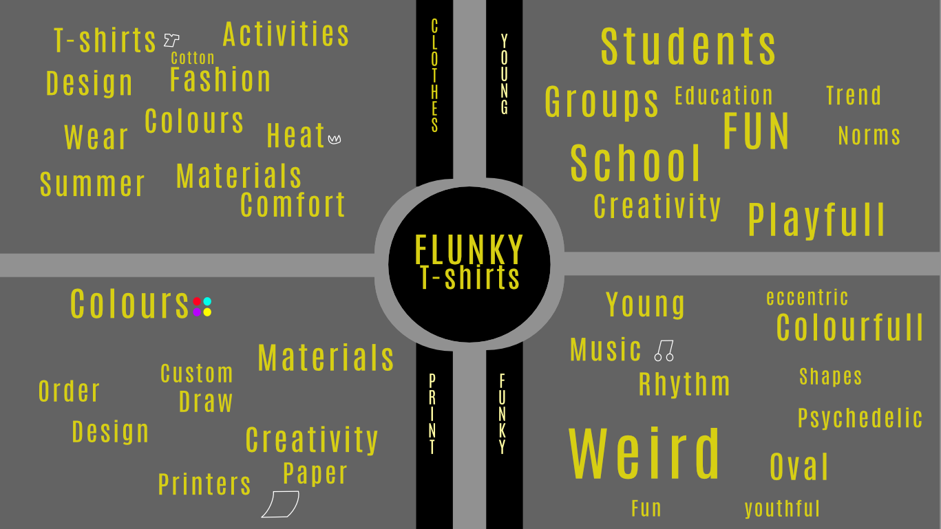
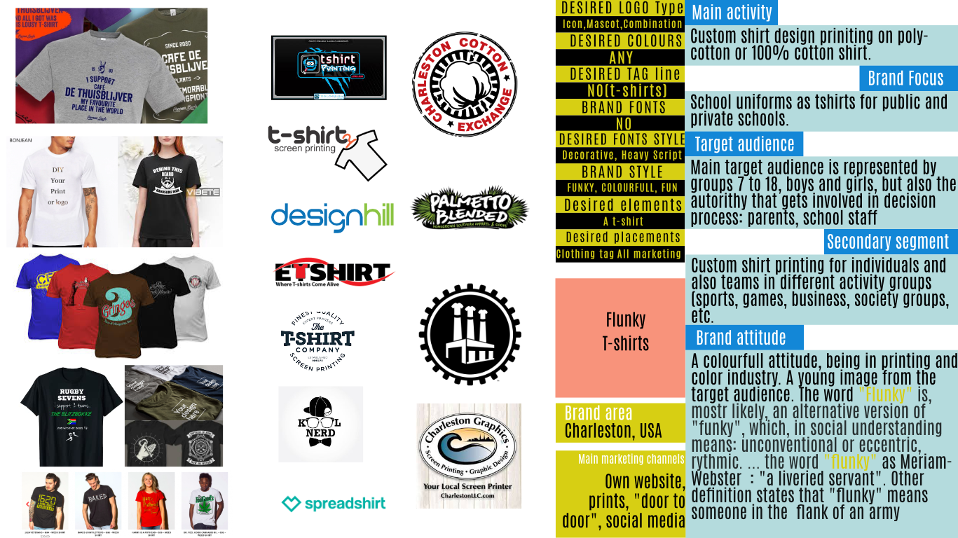
After receiving some information from the client and having a clear picture of his needs and activity, I start to get an overall insight of the domain and the entire industry. I search similar and top brands in the field, I inform myself of the audiences and the general mood of the activity. Firstly I look for informations regarding the activity of the company and the public it serves. I search for a general mood in promoting themselves and I make a sparce concurential analysis at local and global level, to get a better felling of what industry customs and practices are in design. Secondly, I search for defining symbols and words in the industry. In this example, the product- shirts, is a focal point and it could be used as a symbol in the logo if the client agrees with it. I put what comes to mind to an "inspiration board" and from here I have a starting point to designing the elements on paper surface.
Well now, hopefully, I know what I need to build, what I want to design and I have to find out what is the right choice for the project. A logo must be recognaizable, the public must find themselves int what the symbol transmits and represent the industry and the company behind him. Also, a logo must be the right choice for it's parents company and to represent themselves and their ideal. So, in this phase I try to send a first batch of products to see where the project should go from there. After putting ideas on paper I digitazlize them and find the right combination between paper and vectors. Also I try to put a color pallete that represents the mood of the logo and search the font, elements that will be surelly changed until the final delivery.
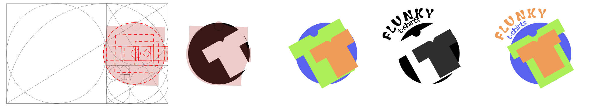
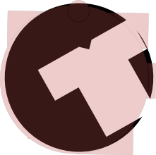

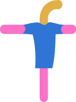
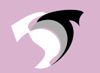
For this project this is the first variant. Scaled with the golden ratio grid and then rotated I tried to include a symbol of the trade - the shirt and to make an "f", the first letter of the brand. The "f" is made by the two shirts and the bigger shirt, the green one can represent an "t". The logo is circular so it can fit well on various surfaces and it can be a coat of arms on the shirt. The industry is easily recognized by this logo. The colours are somewhat to powerfull but they go with the young and fresh felling the brand wants to communicate.
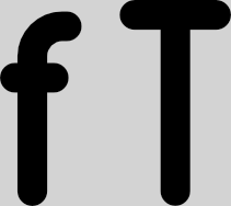

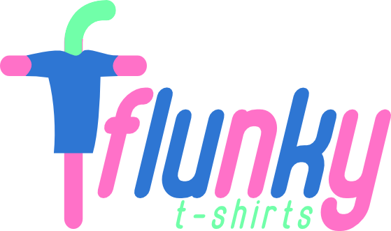
The second variant represents a combination of the lowercase magenta regular font "f" and the uppercase of the same font. I like letter combinations and for this project seemed like a nice combination. The modified letters are entangled in a shirt, to represent well the industry in which the company works. The final design has a funny , character-like feel and the colours, as the font choice give you the feel of youngness and playfullness.
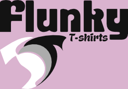
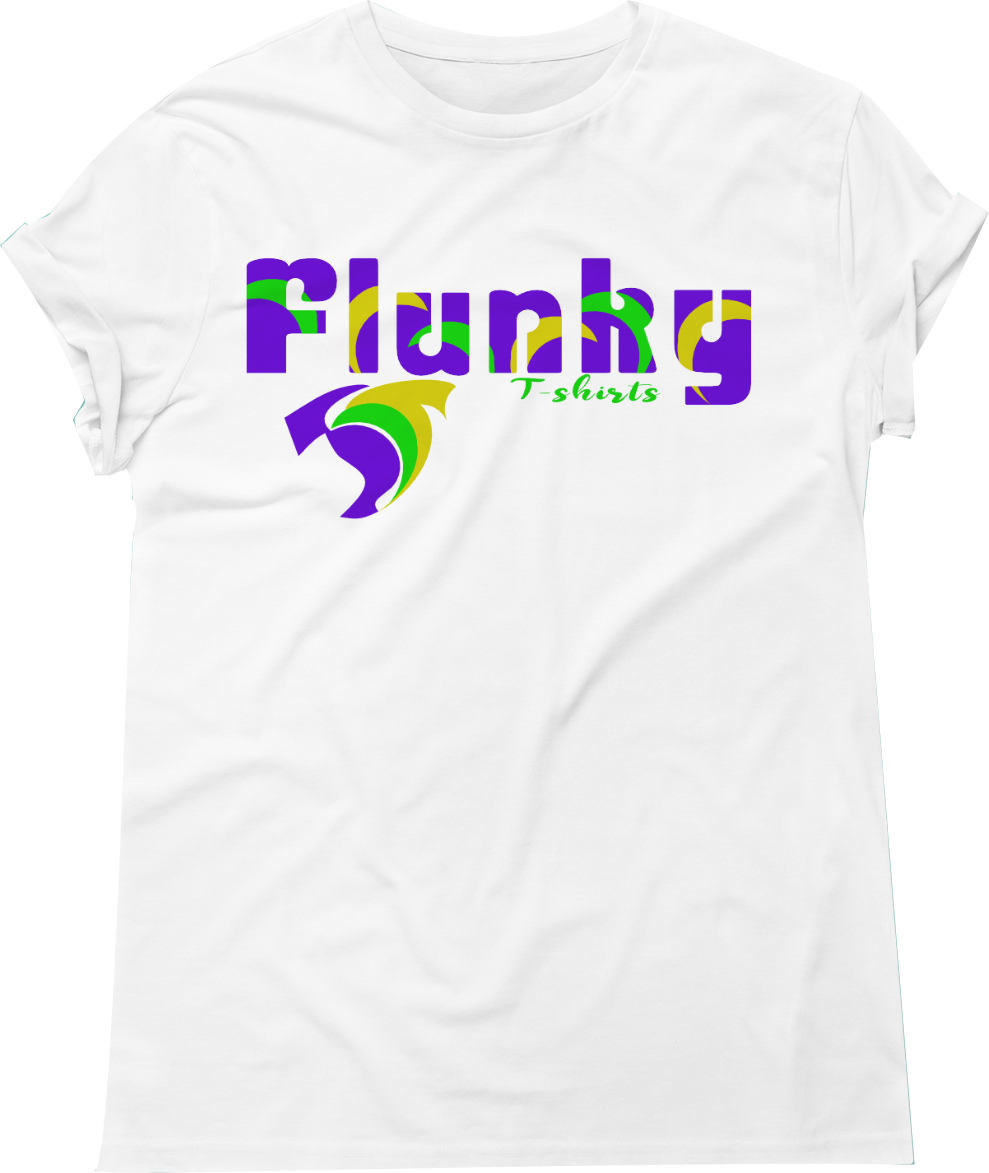
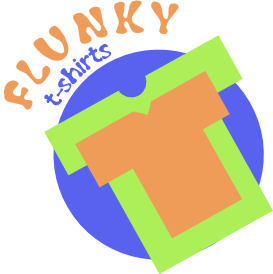
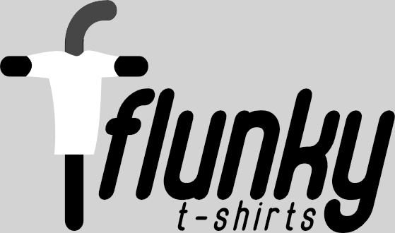
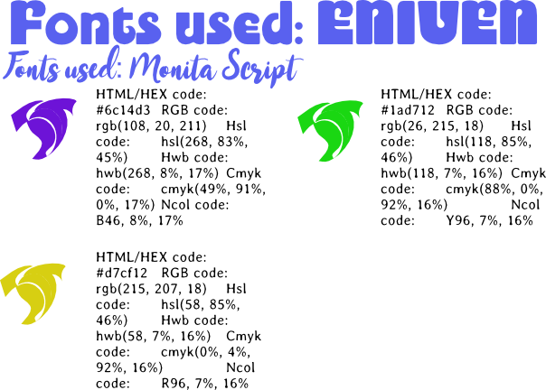
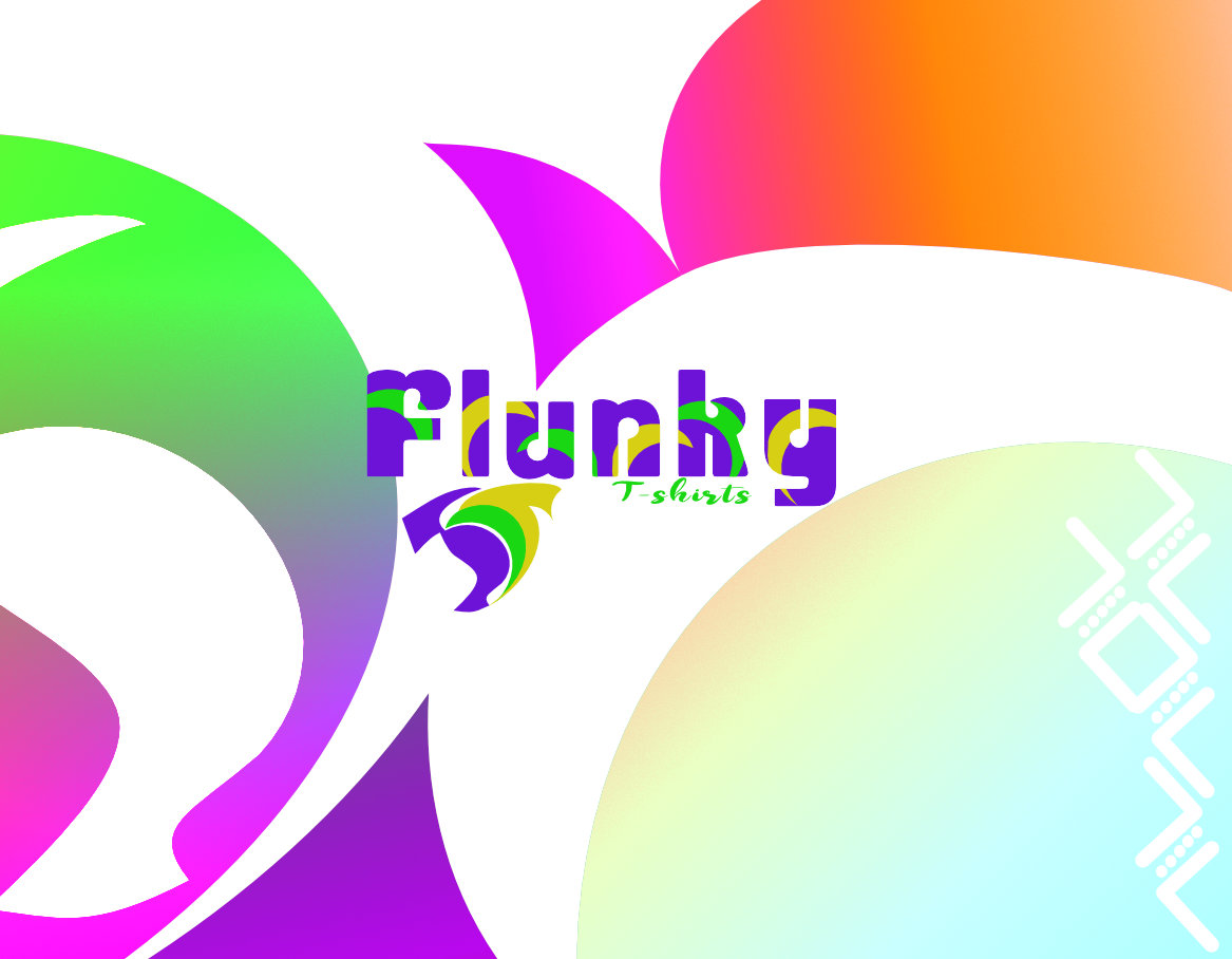
The last variant, the one that I chose to continue this presentation with, is , again a combination of the "t" and "f" letters in the name of the brand. Searching for "flunky" couldn't find the info needed so I thought that the closest word to this is "funky" so I personally fell that this had the right design to represent this brand. I tried for the design to respect the golden ratio principle for proportions and scale. colors, again, are so powerfull only to semnalize the identity of the brand and to bring "colour into life's", being a t-shirt printing service, I promise I am not colorblind. The fonts are having a funky or "flunky" vibe to go with the overal design.
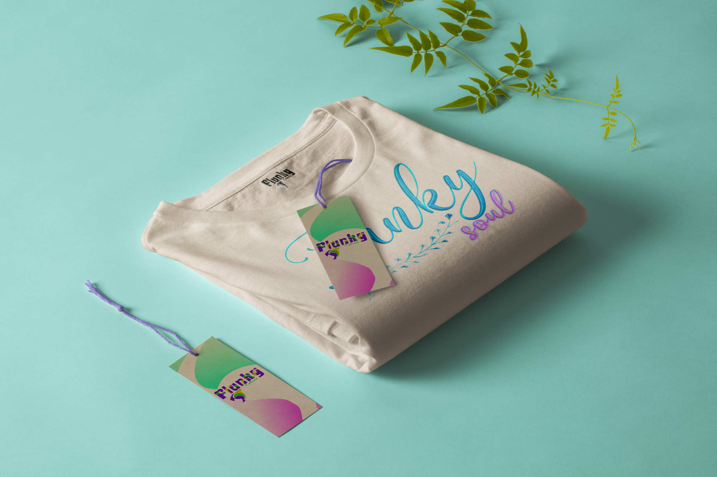
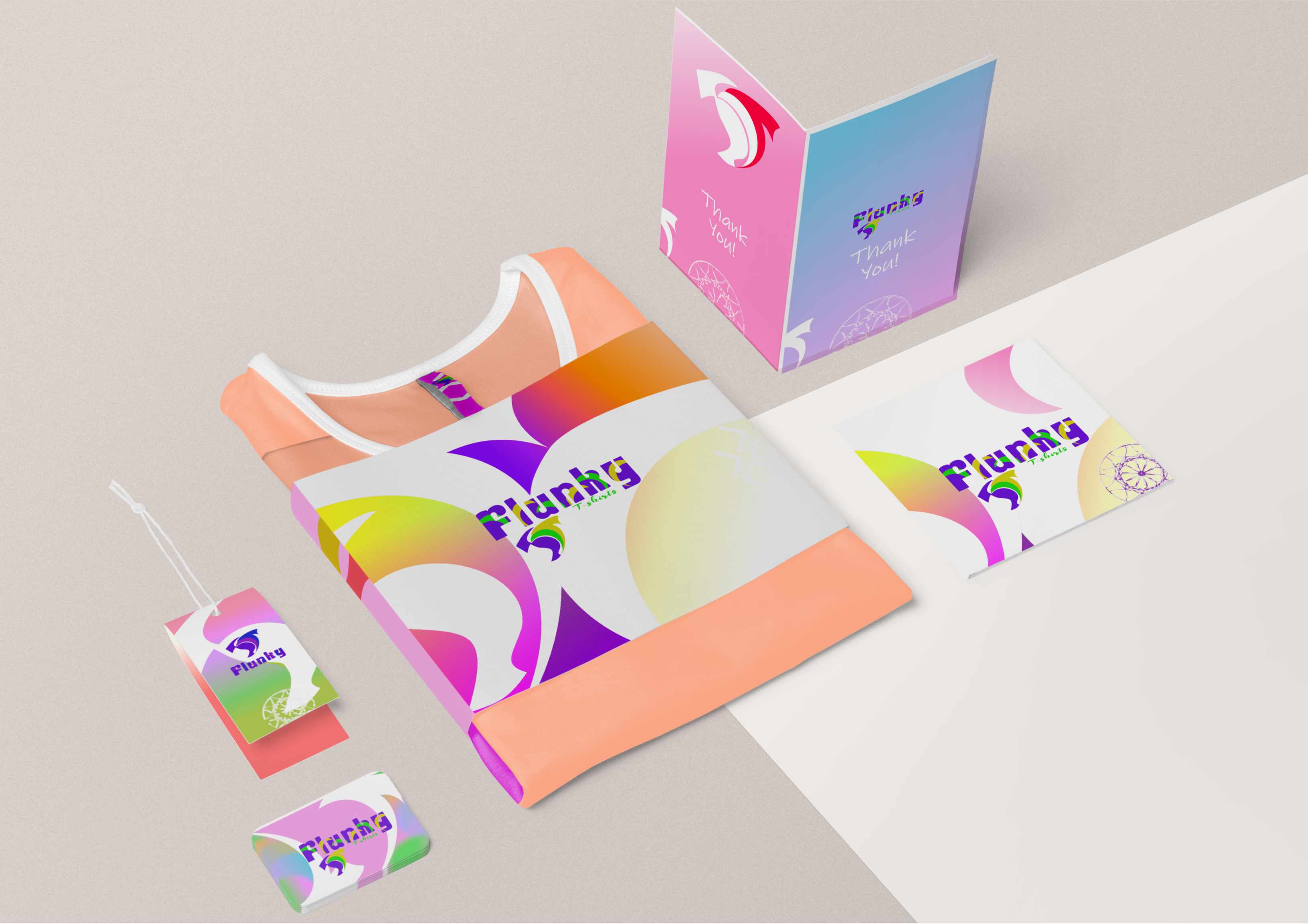
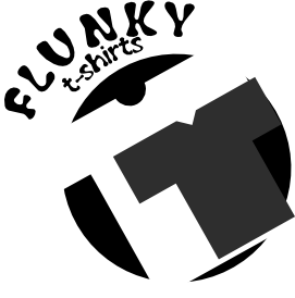
If the logo is accepted as a worthy symbol for the company I start to refine the symbol and test it in various potential marketing materials. I think you cannot have a restaurants that prides with his italian ancestry and promote it as an burger place. So every image must be comprehensive and all -a - round, even if different segments of the marketing efforts treat with huge differences of publics. So, after complete refainment I try to test the logo presentation in various environments and to find designing elements that can aid the marketing of a brand and create an visual identity in concordance with the messages transmited. So for this project I cut the symbol logo into three parts and used the parts in different combinations to provide an design variant fro the branding process.
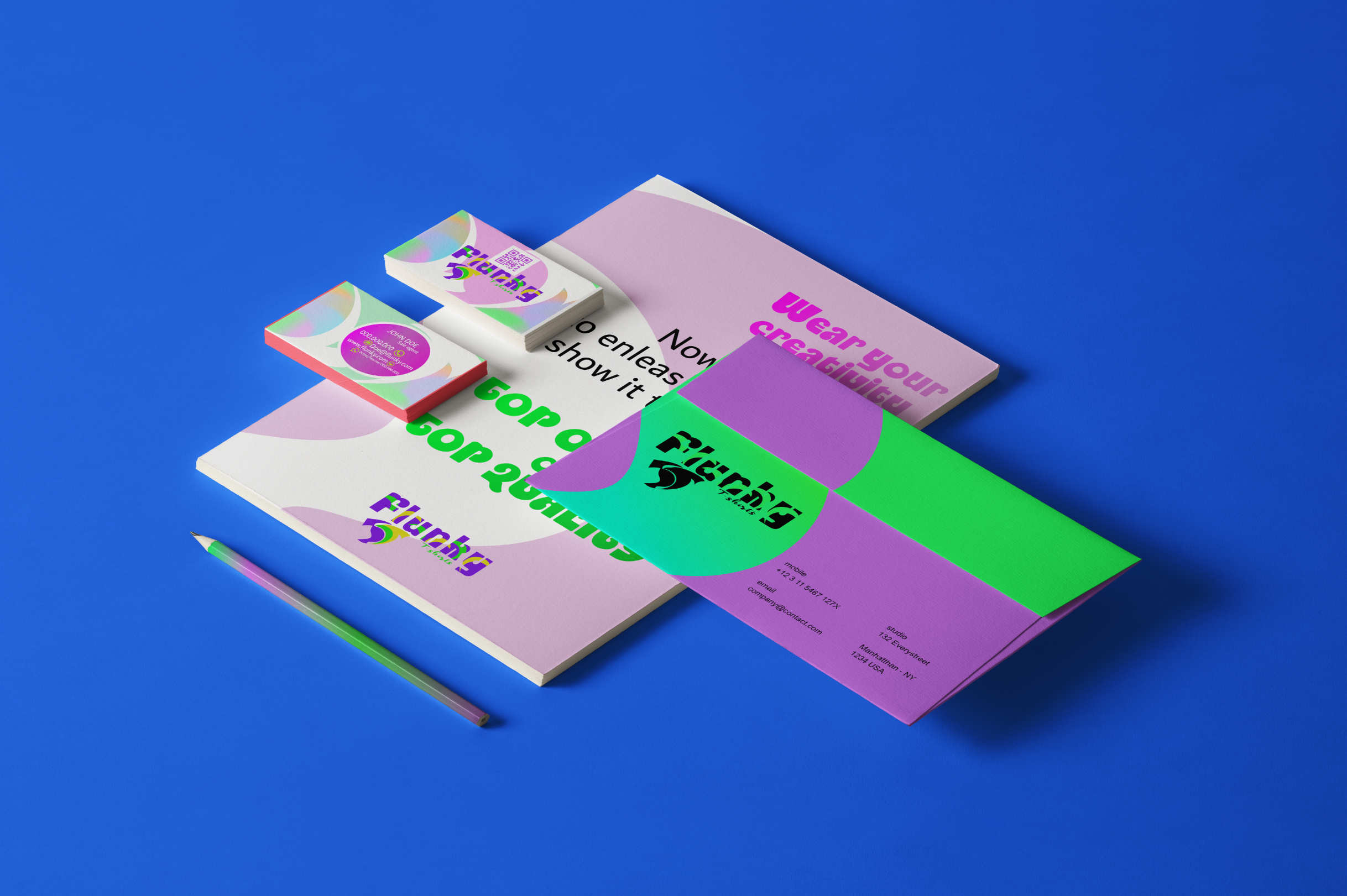
This is a little kit of branding to be used for a starting phase of the branding effort. It contains a bussiness card, a cover letter, and an anvelope. I chosed this type of branding products for marketing delivered towards the institution in an official, printed way.Also the company works into the printing bussiness so they can procure materials easier. There is a need to appeal to a second public - the young generations and this will be made mostly on an online environmnent.
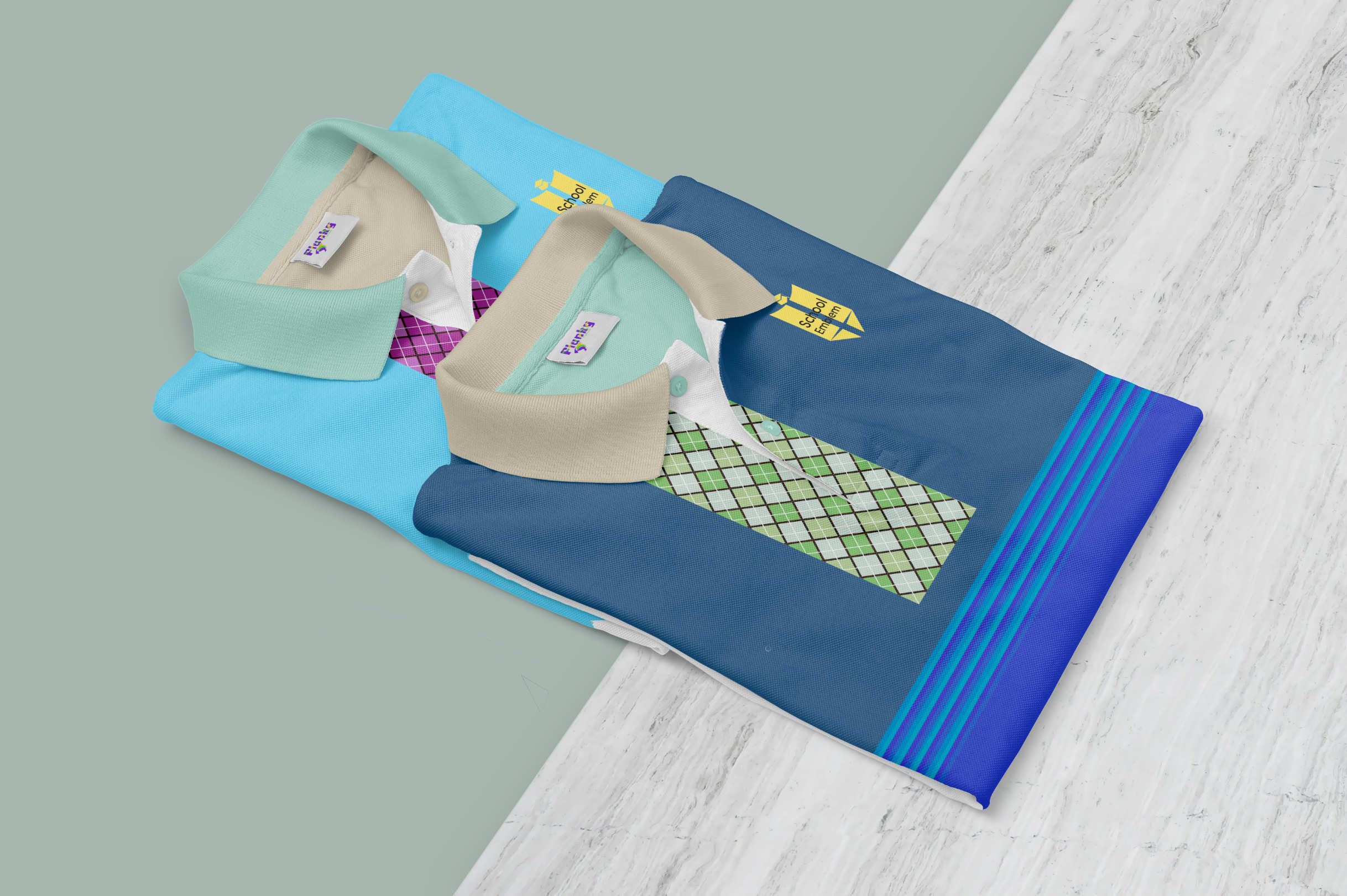
A mockup to represent a posible product to an segment of the desired publics - A school uniform to give the felling of modern mixed with institutional and seriousness.
In every aspect of an activity for me this is the most important. I must respect deadlines , concepts, and in this particular domain, the logo, all must be vector. Even if with inspiration a design can resemble other, many times unwanted and unknown, all parts of the logo must be original and made by me personaly. After the finalization of the processes and if the client is satisfied with the product I send a set of files in different formats of different types for his logo. And that is how a logo is born.